Kelly MacDowell

Bringing Slim Jim’s very ‘00s website into the accessibility standards of today
DESIGN DIRECTION
ACCESSIBILITY
DISCOVERABILITY
SITE ARCHITECTURE
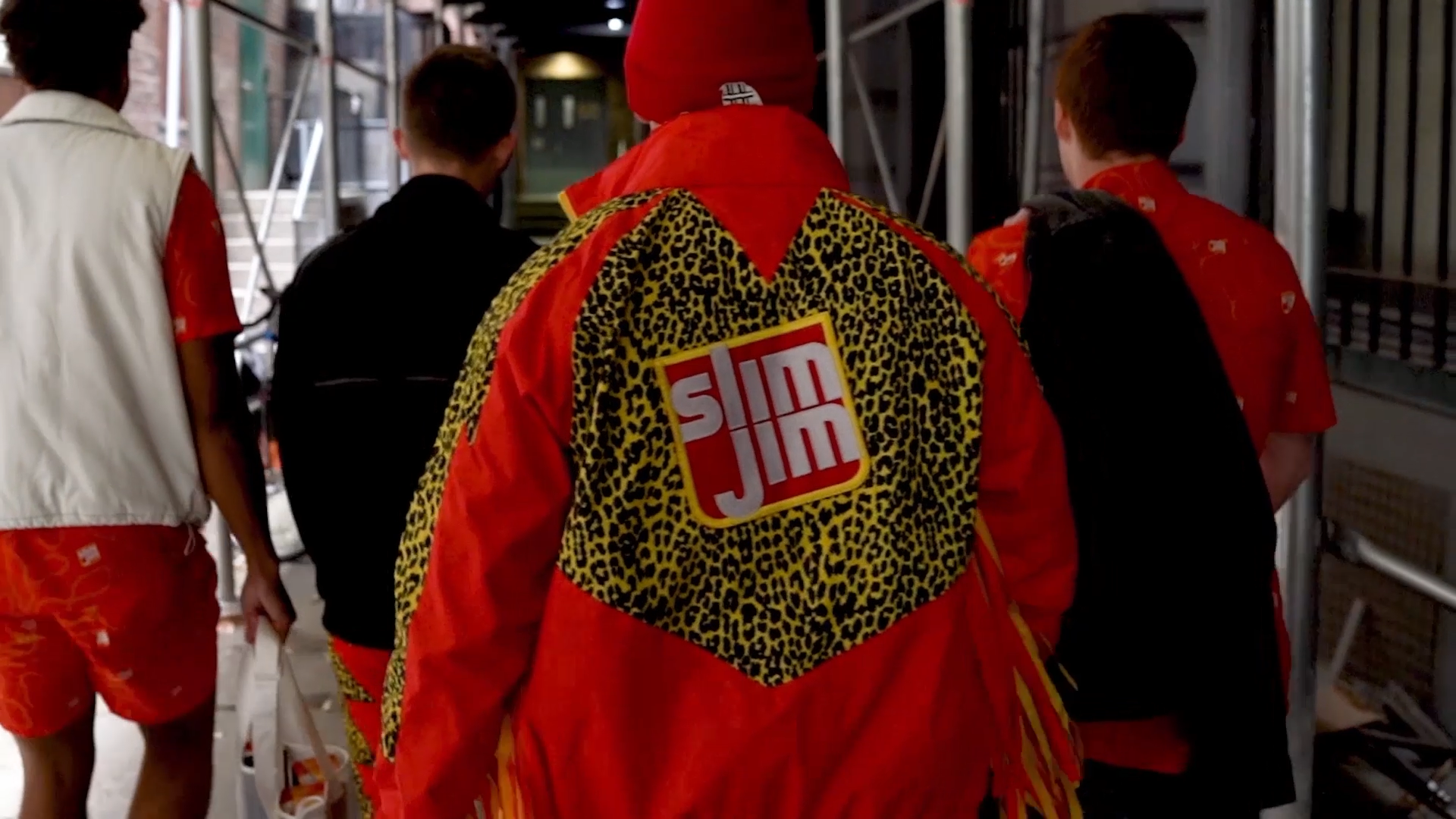
In a classic case of underpromise and overdeliver, my design team took a brief for restructuring Slim Jim’s website and pitched a total redesign. Did the clients ask for that? No. Did they love it? Yes. How did we sell them on it? Scroll and see.
So what exactly did the client ask for?
Their request had two parts:
- Increase Slim Jim product discoverability through organic search and AI summaries.
- Enhance the user experience of navigating and exploring products on the brand website.
I collaborated with Discoverability and Content Strategy to solve for both, defining the best areas of opportunity for leveraging search intelligence and optimizing the site. The team even built out two distinct user journeys for internal review and selection, ensuring alignment on our recommended page builds.
Our efforts were a success, reducing the path to purchase by two pages and improving AI search optimization. But we’re not here to talk about that. (Feel free to reach out if you’d like to hear more, though!)
Below: Slim Jim’s current homepage. Among other issues, white text on the flame background was failing WCAG 2.0 color contrast standards.
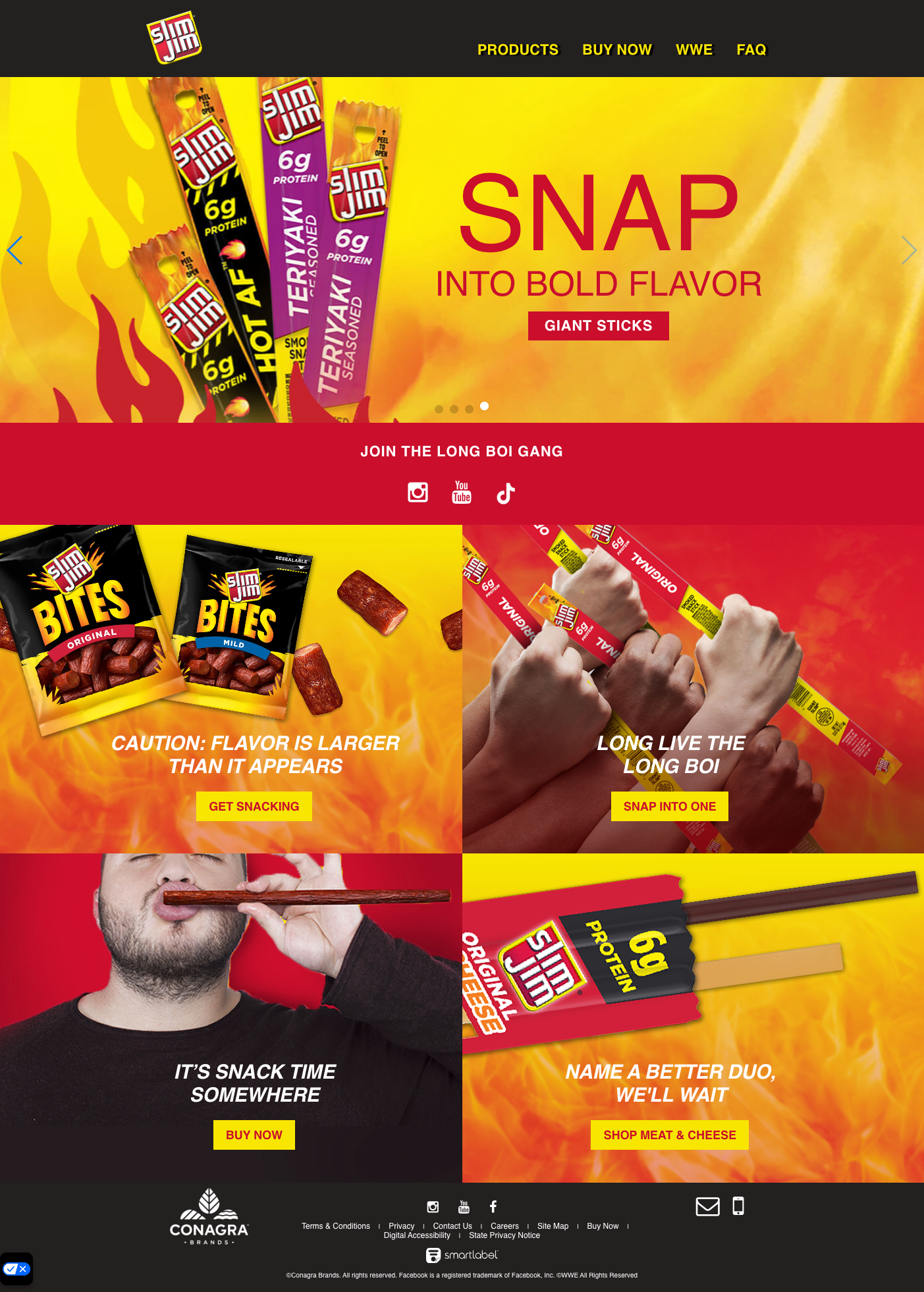
Early stage website audits surfaced a dire need for an accessibility-driven redesign.
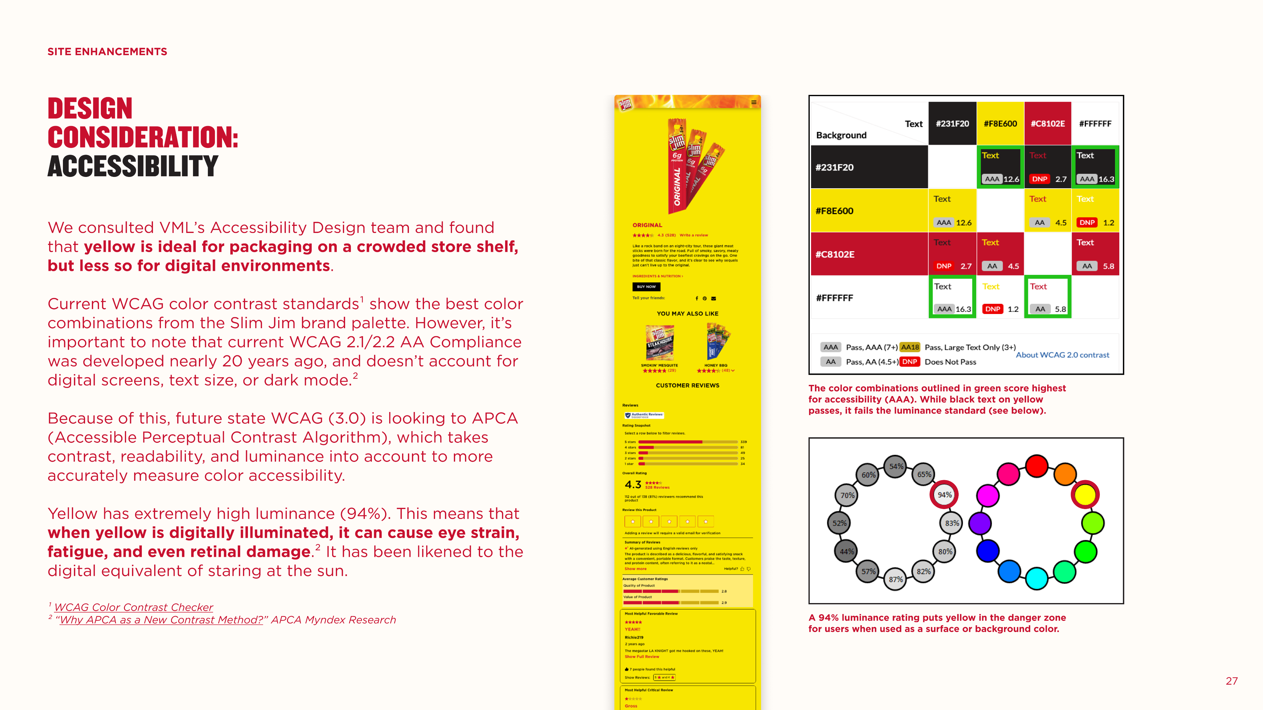
Their entire digital design system was based on Slim Jim’s classic packaging: bright flames and an even brighter yellow, both of which were seriously violating accessibility standards for color. While change felt urgent, I understood the need for sensitivity. We were about to poke major holes in something the client didn’t exactly ask us to look at.

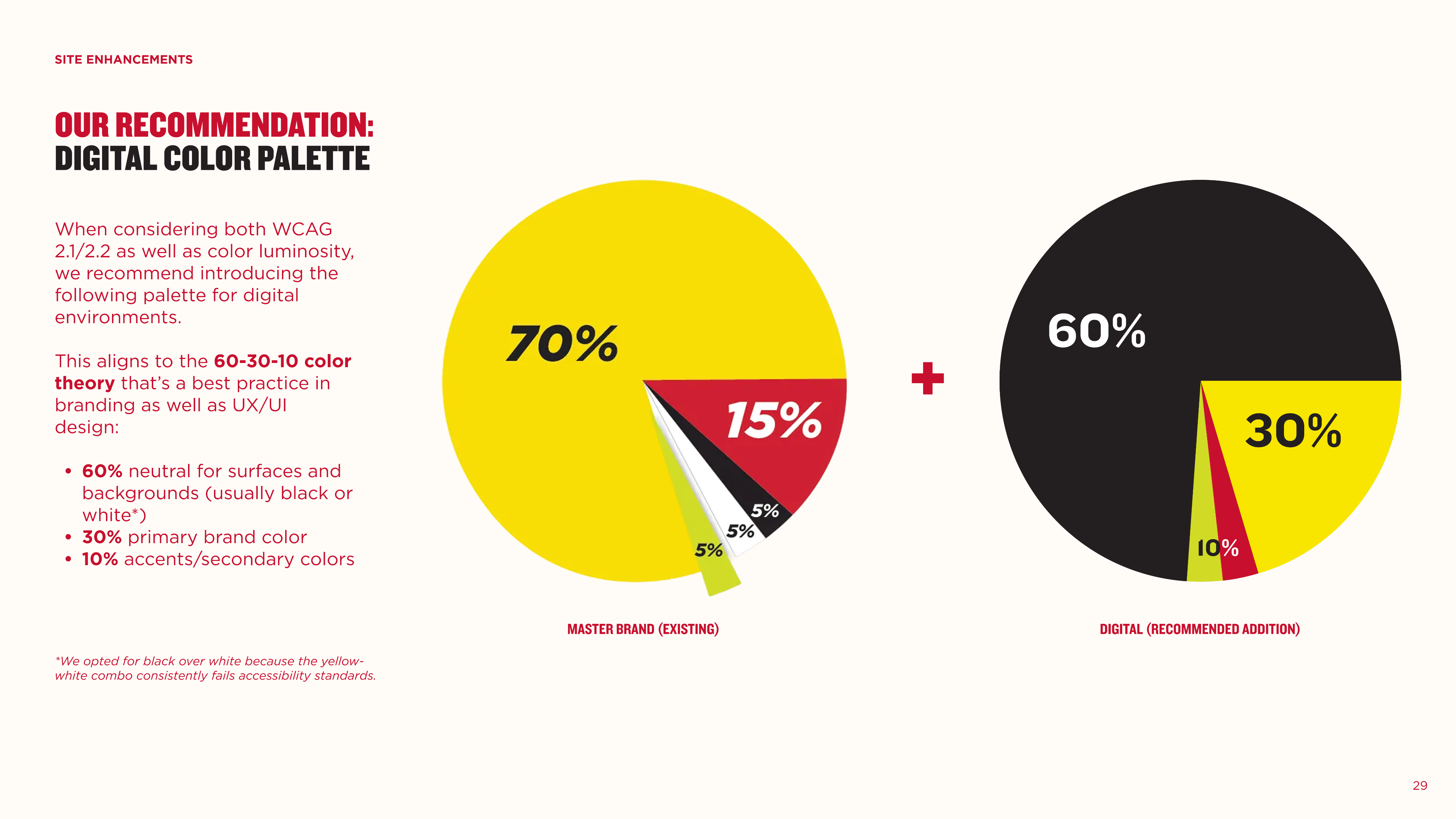
Before: Packaging dictating digital. After: The opposite.
Client saw what we saw, and agreed to adopt all-new digital design guidelines. Not only are they evolving from a legacy of packaging-driven site design, they’ve decided to move away from the flame device entirely, even on their packaging.
Left: Slim Jim’s previous PDP. Right: The updated “dark-mode” design, complete with crawlable content blocks from the original ask.
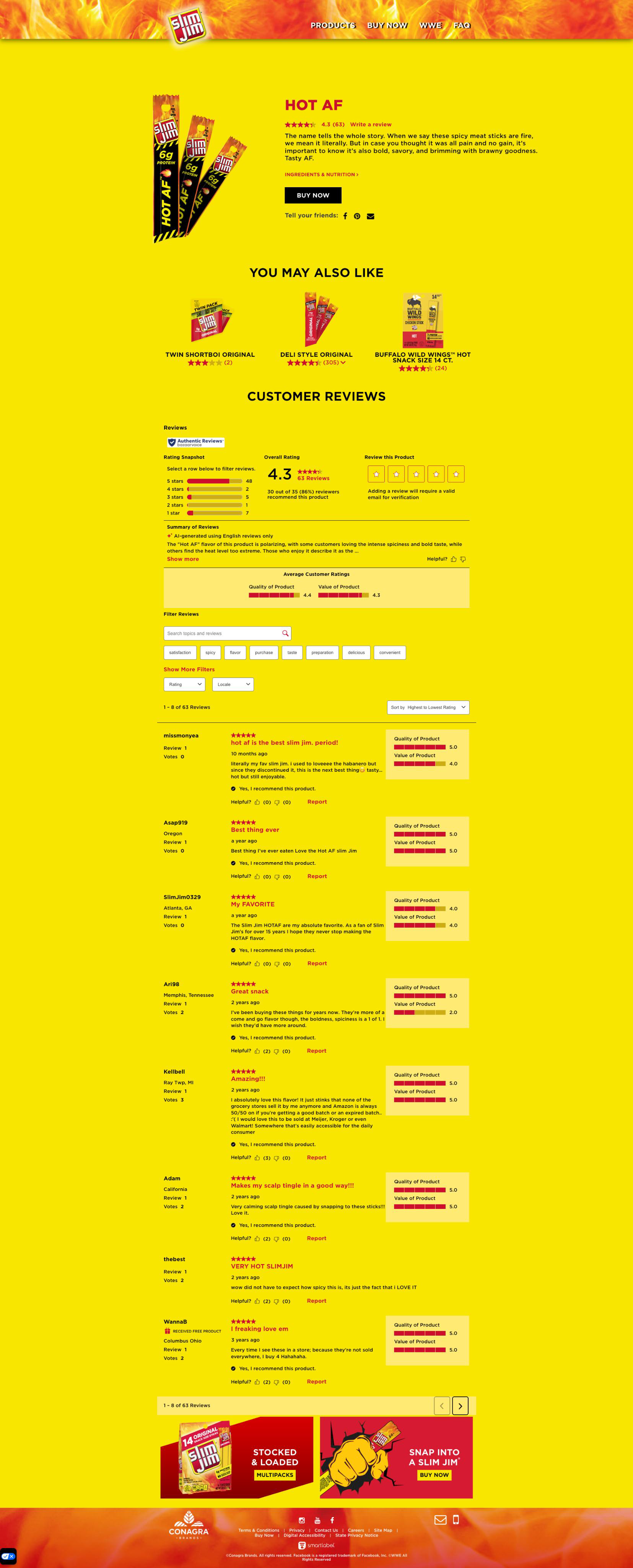
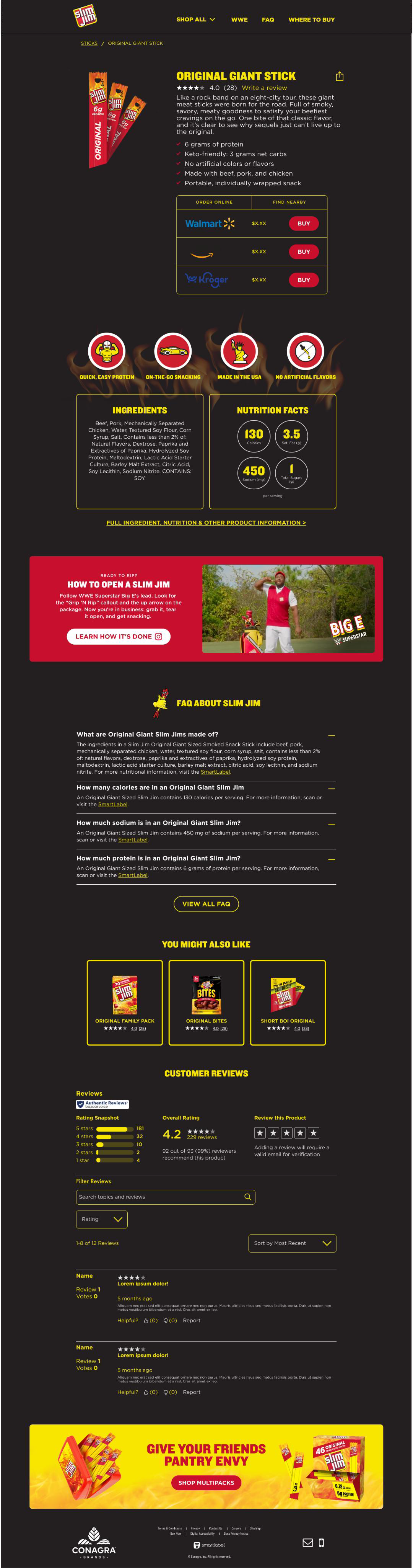
The result: an accessible site, no scope creep, and an upsell.
We were able to sell this redesign without any significant scope creep, as the original ask necessitated net-new page builds and layouts anyway. We did net an additional ask from client, though—a supplemental brief asking us to further enhance the refreshed site with social content for their audience of 1M+ followers (in progress).
The new site is in active development with a rolling launch through Q3 and Q4 of 2026.
Kelly MacDowell
Bringing Slim Jim’s very ‘00s website into the accessibility standards of today
DESIGN DIRECTION
ACCESSIBILITY
DISCOVERABILITY
SITE ARCHITECTURE
In a classic case of underpromise and overdeliver, my design team took a brief for restructuring Slim Jim’s website and pitched a total redesign. Did the clients ask for that? No. Did they love it? Yes. How did we sell them on it? Scroll and see.
So what exactly did the client ask for?
Their request had two parts:
- Increase Slim Jim product discoverability through organic search and AI summaries.
- Enhance the user experience of navigating and exploring products on the brand website.
I collaborated with Discoverability and Content Strategy to solve for both, defining the best areas of opportunity for leveraging search intelligence and optimizing the site. The team even built out two distinct user journeys for internal review and selection, ensuring alignment on our recommended page builds.
Our efforts were a success, reducing the path to purchase by two pages and improving AI search optimization. But we’re not here to talk about that. (Feel free to reach out if you’d like to hear more, though!)
Below: Slim Jim’s current homepage. Among other issues, white text on the flame background was failing WCAG 2.0 color contrast standards.
Early stage website audits surfaced a dire need for an accessibility-driven redesign.
Their entire digital design system was based on Slim Jim’s classic packaging: bright flames and an even brighter yellow, both of which were seriously violating accessibility standards for color. While change felt urgent, I understood the need for sensitivity. We were about to poke major holes in something the client didn’t exactly ask us to look at.
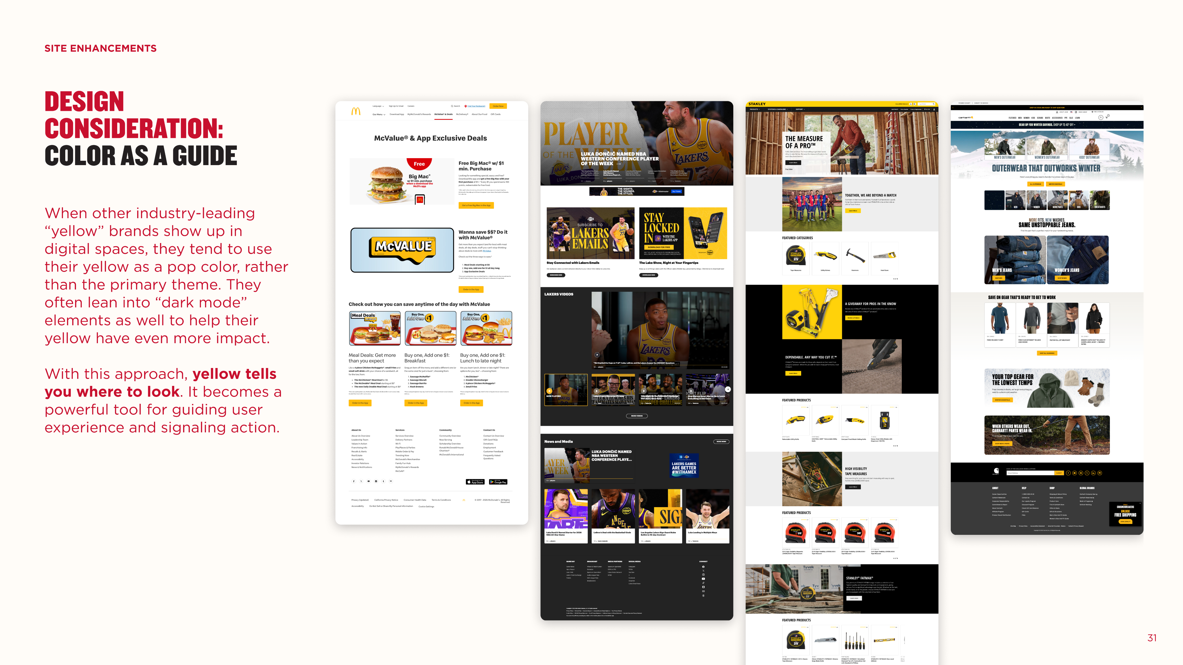
With that in mind, we developed a pitch rooted in data and best practices to make our case without relying on aesthetic preferences. Below are selected slides from our presentation deck:
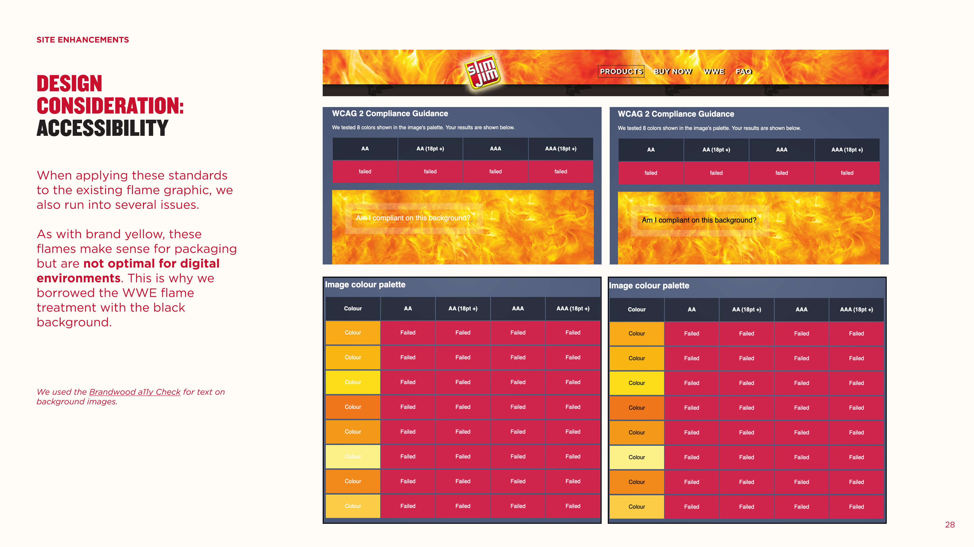
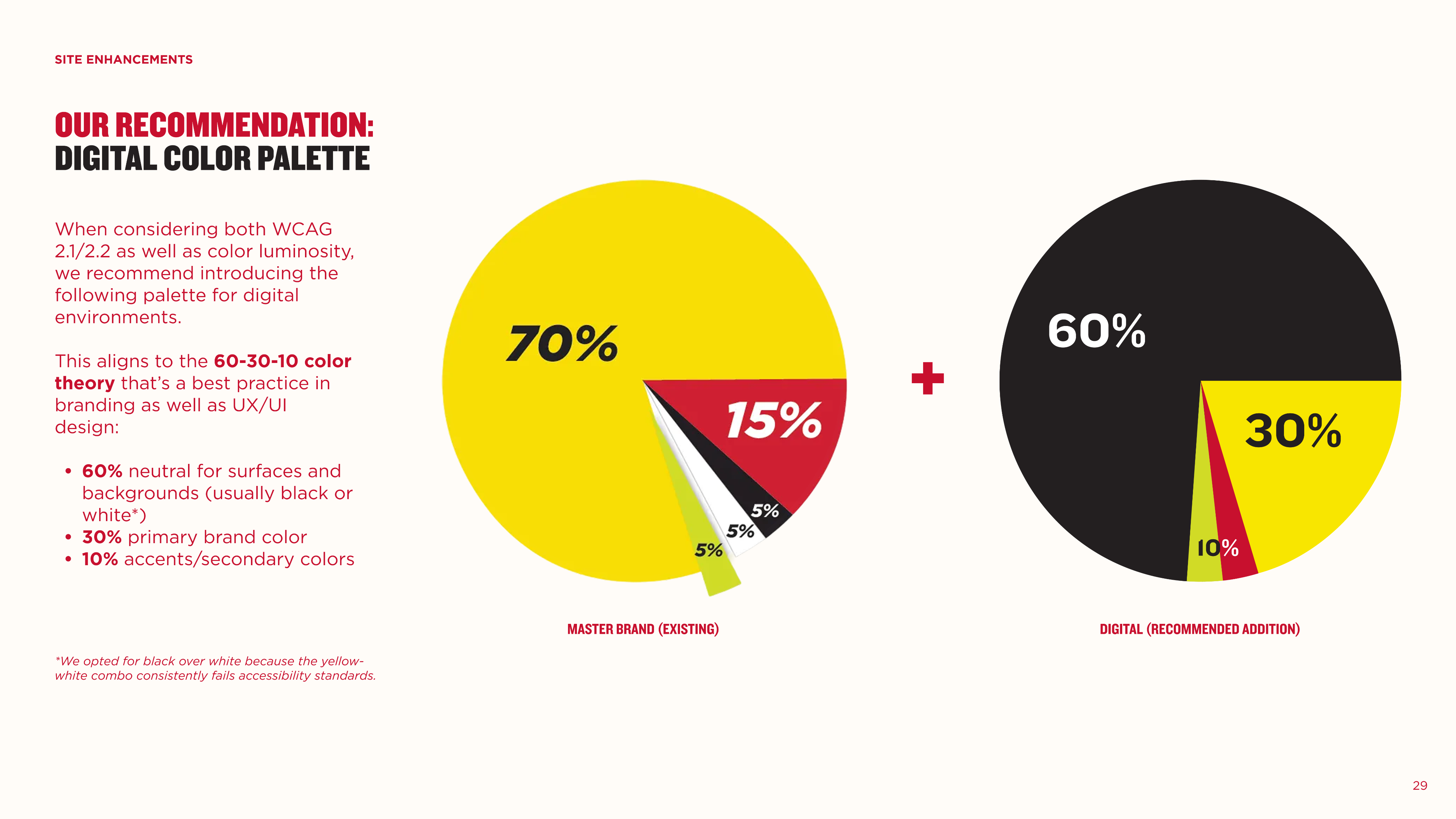
Before: Packaging dictating digital. After: The opposite.
Client saw what we saw, and agreed to adopt all-new digital design guidelines. Not only are they evolving from a legacy of packaging-driven site design, they’ve decided to move away from the flame device entirely, even on their packaging.
Left: Slim Jim’s previous PDP. Right: The updated “dark-mode” design, complete with crawlable content blocks from the original ask.
The result: an accessible site, no scope creep, and an upsell.
We were able to sell this redesign without any significant scope creep, as the original ask necessitated net-new page builds and layouts anyway. We did net an additional ask from client, though—a supplemental brief asking us to further enhance the refreshed site with social content for their audience of 1M+ followers (in progress).
The new site is in active development with a rolling launch through Q3 and Q4 of 2026.